Plotting
Overview
Teaching: 15 min
Exercises: 15 minQuestions
How can I plot my data?
How can I save my plot for publishing?
Objectives
Create a time series plot showing a single data set.
Create a scatter plot showing relationship between two data sets.
matplotlib is the most widely used scientific plotting library in Python.
- Commonly use a sub-library called
matplotlib.pyplot. - The Jupyter Notebook will render plots inline if we ask it to using a “magic” command.
%matplotlib inline
import matplotlib.pyplot as plt

rc('text', usetex=False)
plt.style.use('ggplot')
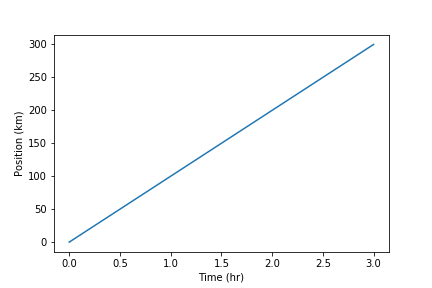
- Simple plots are then (fairly) simple to create.
time = [0, 1, 2, 3]
position = [0, 100, 200, 300]

plt.plot(time, position)
plt.xlabel('Time (hr)')
plt.ylabel('Position (km)')
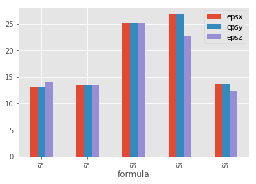
Plot data directly from a Pandas dataframe.
- We can also plot Pandas dataframes.
- This implicitly uses
matplotlib.pyplot. - Before plotting, we convert the column headings from a
stringtointegerdata type, since they represent numerical values
import pandas

data_all = pandas.read_csv('data/jarvis_all.csv', index_col='formula')
eps = data_all.loc['Si', 'epsx':'epsz']
eps.plot(kind="bar");
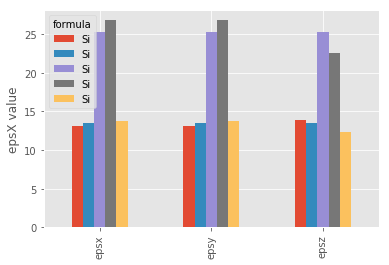
Select and transform data, then plot it.
- By default,
DataFrame.plotplots with the rows as the X axis. - We can transpose the data in order to plot multiple series.
eps.T.plot(kind="bar")
plt.ylabel('epsX value');
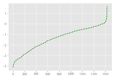
Data can also be plotted by calling the matplotlib plot function directly.
- The command is
plt.plot(x, y) - The color / format of markers can also be specified as an optical argument: e.g. ‘b-‘ is a blue line, ‘g–’ is a green dashed line.
Get formation energy data from dataframe
form_emp = data_all.form_enp.sort_values()
plt.plot(form_emp.values, 'g--')
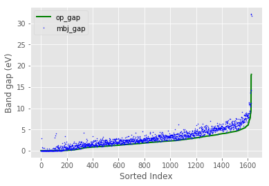
Can plot many sets of data together.
data_sort = data_all.sort_values('op_gap')

plt.plot(data_sort.op_gap.values, 'g-', lw=2, label=r'op_gap')
plt.plot(data_sort.mbj_gap.values, 'b.', ms=1, label=r'mbj_gap')
plt.legend(loc='upper left')
plt.xlabel('Sorted Index')
plt.ylabel('Band gap (eV)');
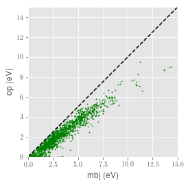
- Plot a scatter plot correlating the MBJ and OP band gap measurements.
- Use either
plt.scatterorDataFrame.plot.scatter
lim = [0, 15]
plt.scatter(data_all.mbj_gap, data_all.op_gap, s=1.5, c='g')
plt.xlim(lim)
plt.ylim(lim)
plt.plot(lim, lim, 'k--')
plt.axes().set_aspect('equal')
plt.xlabel('mbj (eV)')
plt.ylabel('op (eV)');
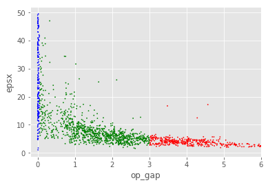
Bandgap versus Bulk Modulus
Make a scatter plot of the bandgap versus the bulk modulus (either
op_gapormbj_gapversus eitherkvorgv). Color the points based on whether the material is metal (bandgap < 0.05), semiconductor (0.05 < bandgap <= 3) or a insulator (bandgap > 3). Usedataframe.plotwith the argumentskind='scatter',s=1.5andcolor=dataframe['color']. Create an additional column in the dataframe for the color. Thesargument controls the size of the points in the scatter plot. Thecolorargument colors the points based on string values in a series or dataframe column (e.g.rfor red orgfor green).Solution
df = pandas.read_csv('data/jarvis_all.csv')

df.loc[:, 'color'] = 'r'
df.loc[df.op_gap < 3, 'color'] = 'g'
df.loc[df.op_gap < .05, 'color'] = 'b'

df.plot('op_gap', 'epsx', kind='scatter', s=1.5, color=df['color'])
plt.xlim([-0.2, 6]);
Saving your plot to a file
If you are satisfied with the plot you see you may want to save it to a file, perhaps to include it in a publication. There is a function in the matplotlib.pyplot module that accomplishes this: savefig. Calling this function, e.g. with
plt.savefig('my_figure.png')will save the current figure to the file
my_figure.png. The file format will automatically be deduced from the file name extension (other formats are pdf, ps, eps and svg).Note that functions in
pltrefer to a global figure variable and after a figure has been displayed to the screen (e.g. withplt.show) matplotlib will make this variable refer to a new empty figure. Therefore, make sure you callplt.savefigbefore the plot is displayed to the screen, otherwise you may find a file with an empty plot.When using dataframes, data is often generated and plotted to screen in one line, and
plt.savefigseems not to be a possible approach. One possibility to save the figure to file is then to
- save a reference to the current figure in a local variable (with
plt.gcf)- call the
savefigclass method from that varible.fig = plt.gcf() # get current figure data.plot(kind='bar') fig.savefig('my_figure.png')
Key Points
matplotlibis the most widely used scientific plotting library in Python.Plot data directly from a Pandas dataframe.
Select and transform data, then plot it.
Many styles of plot are available: see the Python Graph Gallery for more options.
Can plot many sets of data together.